About This Project
SERVICES:
Brand Strategy
Branding
Art Direction
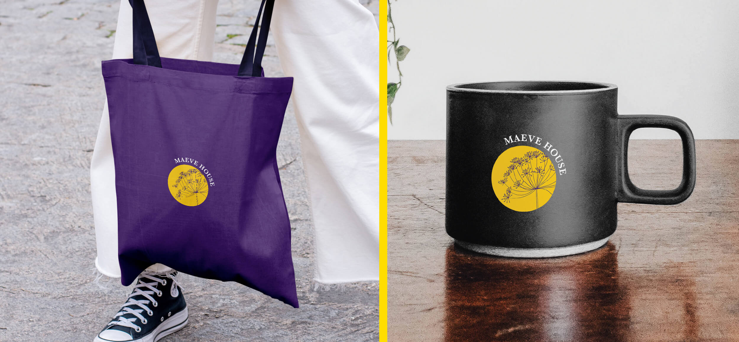
Brand Merchandise
Collateral Design
Iconography & Illustration
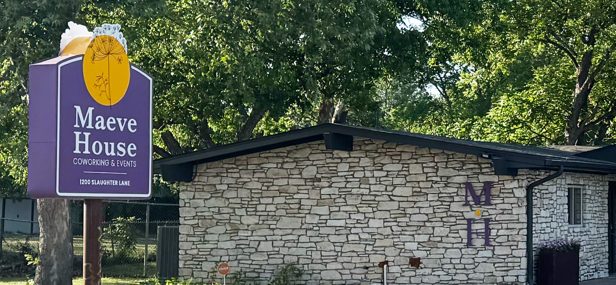
Environmental Design
A brand that feels like a third place
The brief:
Maeve House was envisioned as a third place—a beautifully designed sanctuary where people could gather, connect, and recharge. It offers coworking, but that’s just one part of the story. The space also hosts events, fosters community, and feels more like a home or studio than an office. Our job was to design a brand that captured that nuance.
Our approach:
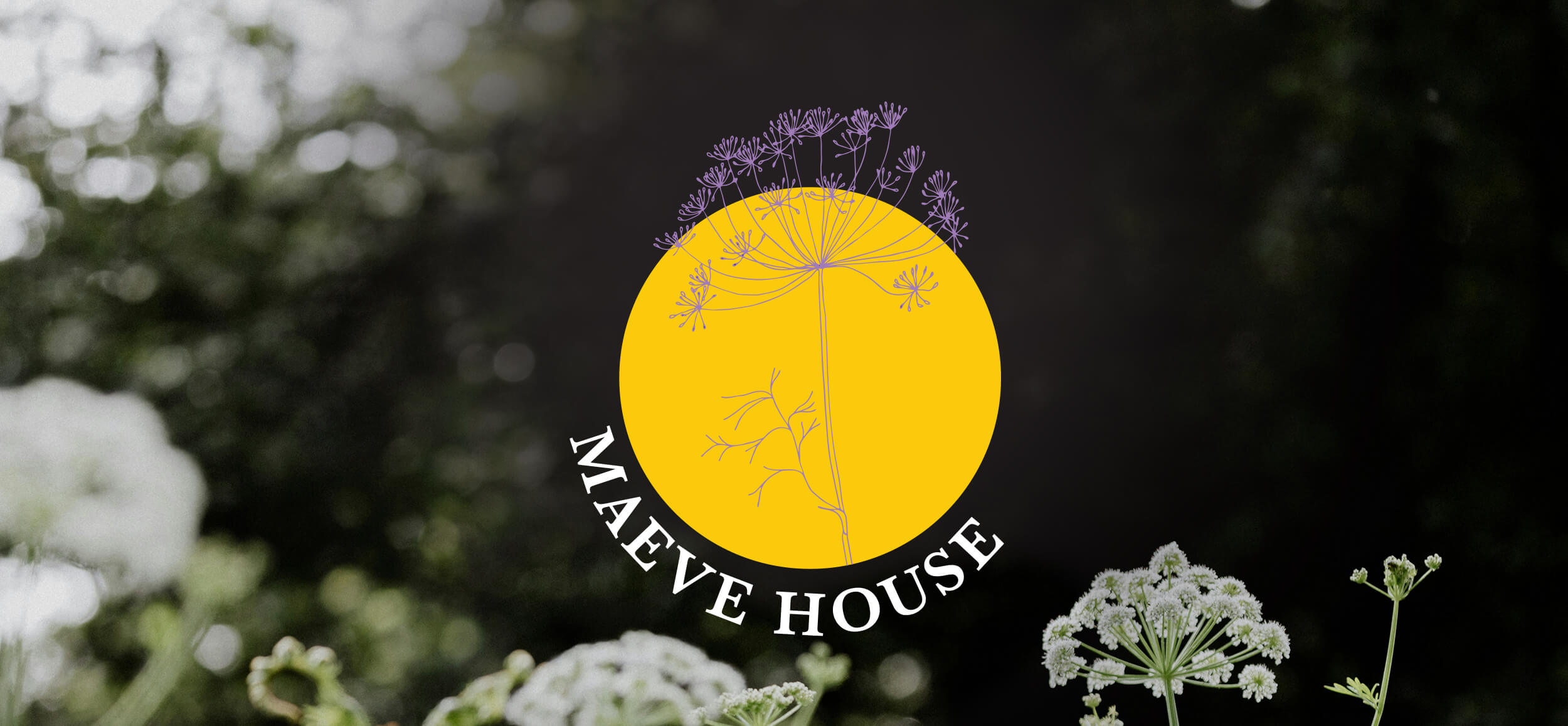
Rather than lean into traditional coworking language, we focused on the emotional qualities of the space. Once we began brainstorming organic symbols of community, sanctuary, protection, and strength, we arrived at Queen Anne’s lace—a wildflower known for its resilience, softness, and quiet symbolism. It became the perfect metaphor for the space Maeve House was creating.
The logo:
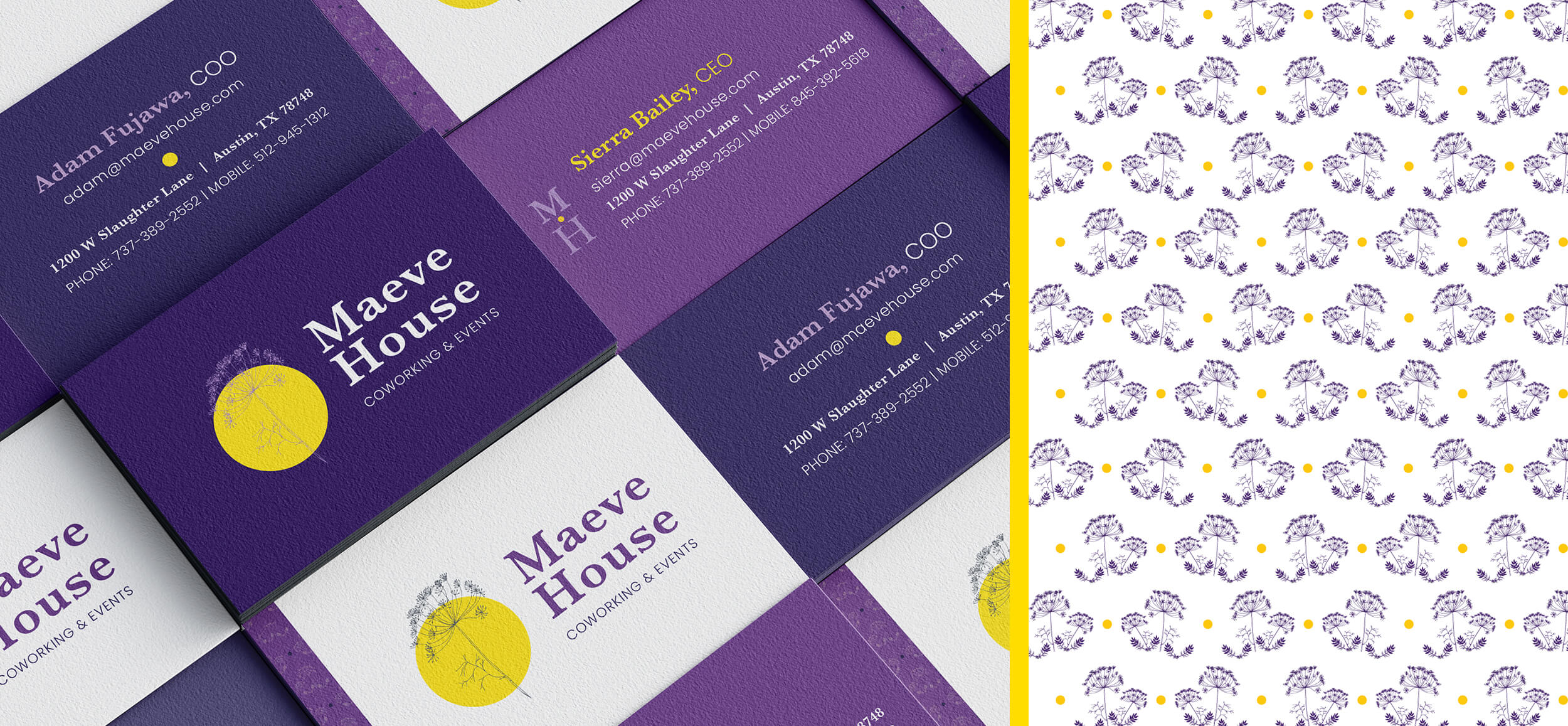
The final mark features an illustrated Queen Anne’s lace set against a golden sun. It’s a delicate yet grounded image—both welcoming and quietly strong. The sun represents warmth and presence, while the flower’s fine structure evokes protection and connection. Together, they speak to the brand’s core values: care, community, softness, sanctuary, and light.
The brand system:
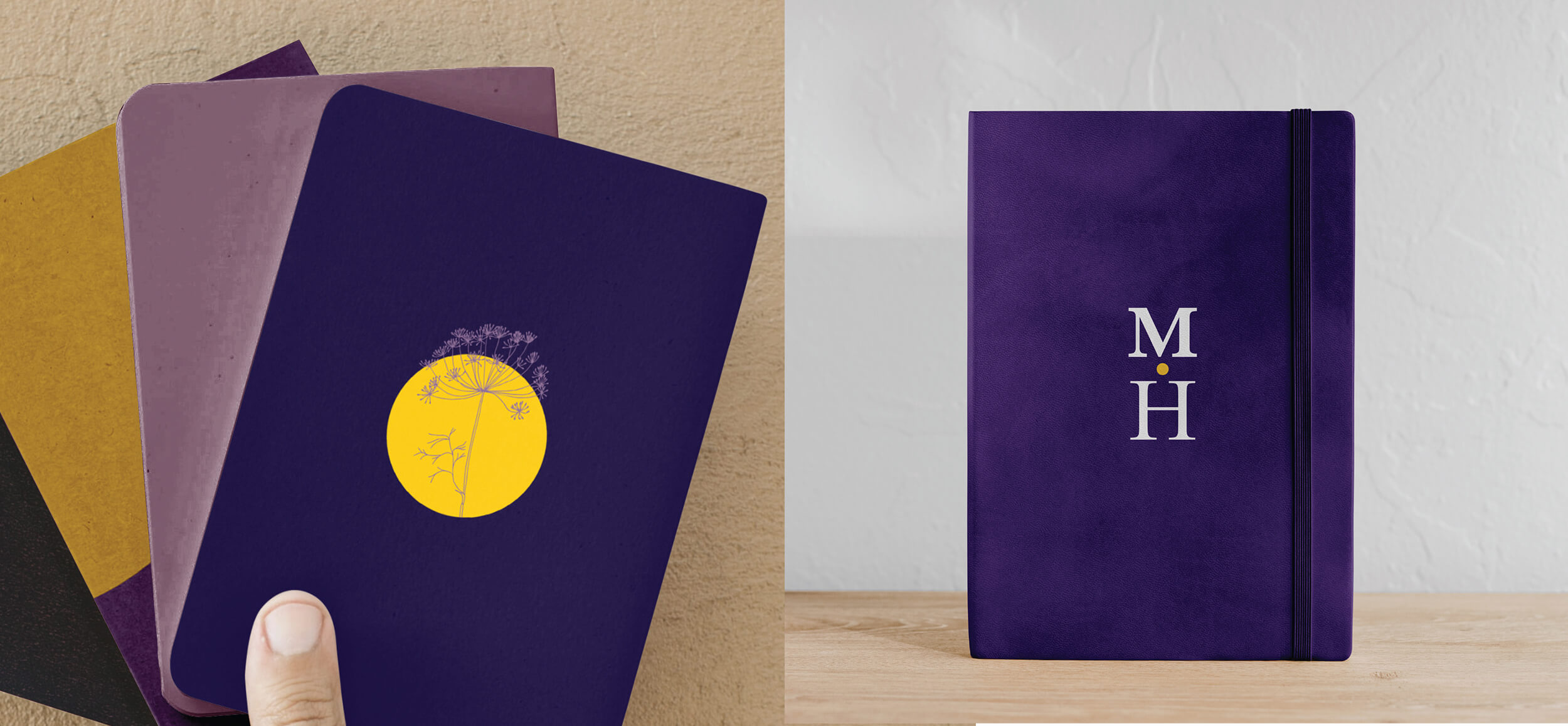
Maeve House’s visual identity extends beyond the logo into a rich, expressive palette of color and tone.
We leaned into a palette that feels both vibrant and grounded, pairing a luminous golden yellow that evokes energy, warmth, and presence with deep violets and soft lavenders that signal creativity, reflection, and quiet strength.
Together, these tones reflect the emotional range of the space—welcoming, expressive, and quietly confident.This mix of bold and soft tones echoes the balance Maeve House aims for—energetic, but never loud. Inviting, but not overstated. Calm, but never dull. Each element was chosen to support the idea of a space that holds you without overwhelming you.

Interior collaboration:
Because Maeve House is as much an experience as it is a brand, the identity was designed to integrate seamlessly into the physical space. We worked closely with the interior designer, sharing the Queen Anne’s lace concept early in the process. From wallpaper to paint choices, the brand story directly influenced spatial decisions—ensuring the space didn’t just carry the brand, but embodied it.
The takeaway:
Maeve House shows how visual identity can go beyond aesthetics to shape an environment—both physical and emotional. The Queen Anne’s lace isn’t just a logo. It’s a symbol of what the space offers: a place to grow, to gather, and to be held.
